Tuesday, July 24, 2012

Making a house a home

Here's my latest ongoing decorating project. I collaborated with some good friends on their new home. It has been the most fun I've had so far in my decorating career. It feels wonderful to be able to teach people about their spaces so they feel empowered to continue decorating or evolving their spaces even after I'm not involved. That's what it's all about.

My good friends bought a new home for their small family a few months ago. With this move they decided that it was time to leave all of their hand-me-down miss-matched furniture that they didn't select and didn't really like. That was a big risk and it meant that they'd have virtually no furniture for a little while. They asked me to come on board and help them furnish their new living room, kitchen, bedroom and patio. 


Things to consider when working with this space:
The room has very high ceilings with incredible period deep relief crown molding, marble mantle pieces, wide plank wood floors, great light and a modern kitchen. With some of these elements came some challenges. 

First, the bones of the main room are formal and my friends are very casual and have a toddler. So how can we honor the room, but make it livable for a family? 

Second, the main room was originally two rooms each with a marble mantelpiece and chimney. How do we work with two mantle pieces (two focal points) in this now joined space? How do we work with this narrow rectangle that needs to be a living room, music room, dining room, office, and toddler play space?

Third, I couldn't be on-site every day so we'd need to work remotely. This meant that they would need to shop and research mostly on their own. When they were at stores or on Craigslist, they'd send me photos of chairs/art/shelves/rugs/tables – anything! And I'd weigh whether that style/color/function would work with our mission to blend the traditional Victorian bones and their contemporary casual lifestyle. I provided the direction and the second opinion. I helped them decide whether to splurge or pass. 

Fourth, They had a budget of $10,000. This sounds like a lot, but we had a long list of things to find:


  1. paint
  2. couch
  3. living room rug
  4. 2 side chairs
  5. end tables
  6. coffee table
  7. book shelves
  8. side lamps
  9. media center
  10. dining room table
  11. dining room chairs
  12. dining table linens
  13. kitchen table
  14. buffet and kitchen storage
  15. patio furniture
  16. art for walls and style two mantles
  17. desk
  18. king bed frame
  19. king mattress
  20. bed linens
  21. bedroom rug
  22. nightstands
  23. bedside lamps

Here are a few of the before and during photos. They're all quick and dirty, stay tuned for some more official and less iPhone-y images shortly. I'll add actual product links and paint colors soon.

Fresh paint, dining room table

New couch (Crate and Barrel), pillows (HomeGoods), white side chair (Craigslist) and piano* (Eddie's Furniture)

Media shelf (Ikea) and rug (Dash & Albert)

Mustard side chair (Craigslist)

Mirror end table (Craigslist)

Bertoia replica dining chairs–for a steal! (Craigslist)

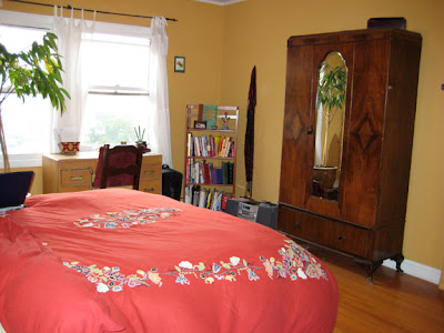
New bed, linens, rug (all Craigslist), nightstands (Urban Outfitters), lamps (Ikea?) and art (HomeGoods)


* There's an amazing story about this piano... 
Being at the right place at the right time = a fabulous surprise and a dream come true.


Tuesday, February 8, 2011

Ohdeedoh: Nursery Tour entry 2011

Here are a few photos of our nursery/bedroom/office loft. Our home is a one bedroom, so the nursery stuff is split between our bedroom and the office. The similar color palette and calm style helps the spaces still feel cohesive.

I have submitted them to a sister site of Apartment Therapy, Ohdeedoh. It's like crack for pregnant ladies looking for nursery decoration ideas. I'm currently waiting to hear back if they'll feature my space. Fingers crossed...


Belvedere St. Bedroom

The client had been living in the space for many years without a big update. She was entering a new phase in her life and wanted her space to reflect her fresh spirit.

We worked together to maintain beloved objects and purge things she's grown beyond. All the while injecting some calm and relaxing energy.

Many of the new furnishings and decor were found on Craigslist or other discounted shops to adhere to a very limited budget.

AFTER:


BEFORE:


Apartment Therapy Contests: Room for Color 2009

Here's my submission for the Apartment Therapy 2009 Room for Color contest. I got 115 thumbs up votes!


Color Inspiration: I fell in love with this light yellow-green a few years ago when I used it in my home office. When we moved into this condo the bedroom was a hideous denim blue.
Color Inspiration continued: My husband and I decided to bring in this serene yellow-green but give it a good anchor with the cocoa brown. I always awaken with a smile when I see this color. The rest of the house has a lot of color. This is our most mellow palette. Like a breath of fresh air.

Colors Used: Ace: Milkweed Pod (powdered hot cocoa brown) , Ace: Outback (soft yellow-green)


Color Tip: All the colors don't have to match perfectly. Nature doesn't have a swatchbook. Keep it in a similar family and your space will feel more spontaneous.


Apartment Therapy Contests: Fall Colors 2008

Just for fun, I entered a home decorating contest sponsored by the Apartment Therapy blog. I made it to the top 8! Here's my submission for the 2008 Fall Colors contest:


What inspired you to use color? I adore bright colors and can never seem to pair down my palette. When we walk in the door on a sunny morning, the light streaming in is breathtaking. The colors make it a lively space for entertaining. Our condo had a lot of angular and cool white walls when we moved in. We brought in the bright pinky/red tones with olive green, light blue, buttery yellow and orange accents to warm it up...
...Then we threw a housewarming party and asked our friends for plants to make it feel alive (and add bright green!). Upstairs in the bedroom and office we opted for more fresh yet muted and calming colors. Things move more slowly in this space, it’s comforting. I always wake up in a good mood when I open my eyes to this color yellow-green.
Color Tip: Go for it! If you tend to fall in love with lots of colors and fun accessories or furniture (like I do), just go for it. If the color reflects your personality and makes your heart skip - it was meant to be! And it will make you happy every time you see your fabulous wall or piece. If it's a wall you're after, paint is cheap and it's worth the fun change it brings. But remember to test it in all lights - one hour's olive green is another hour's mustard yellow.
Colors Used: Benjamin Moore: Granada Hills Gold (dining room) Ace: Midas Touch (chimney) Ace: Milkweed Pod (brown behind TV and bedroom) Ace: Outback (bedroom green)


Friday, July 9, 2010

Typography chairs.

Ahem. Why is this chair not in my house at this very moment? It's a corrugated cardboard dream. Perhaps I need to get my x-acto primed and start collecting spare boxes...

Thursday, June 10, 2010