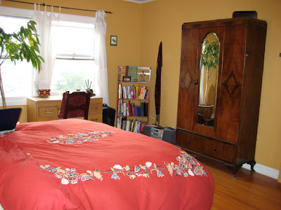
Here are a few photos of our nursery/bedroom/office loft. Our home is a one bedroom, so the nursery stuff is split between our bedroom and the office. The similar color palette and calm style helps the spaces still feel cohesive.
I have submitted them to a sister site of Apartment Therapy, Ohdeedoh. It's like crack for pregnant ladies looking for nursery decoration ideas. I'm currently waiting to hear back if they'll feature my space. Fingers crossed...
Tuesday, February 8, 2011
Belvedere St. Bedroom
The client had been living in the space for many years without a big update. She was entering a new phase in her life and wanted her space to reflect her fresh spirit.
We worked together to maintain beloved objects and purge things she's grown beyond. All the while injecting some calm and relaxing energy.
Many of the new furnishings and decor were found on Craigslist or other discounted shops to adhere to a very limited budget.
We worked together to maintain beloved objects and purge things she's grown beyond. All the while injecting some calm and relaxing energy.
Many of the new furnishings and decor were found on Craigslist or other discounted shops to adhere to a very limited budget.
AFTER:
 |
 |
BEFORE:
Apartment Therapy Contests: Room for Color 2009
Here's my submission for the Apartment Therapy 2009 Room for Color contest. I got 115 thumbs up votes!
Color Inspiration: I fell in love with this light yellow-green a few years ago when I used it in my home office. When we moved into this condo the bedroom was a hideous denim blue.
Color Inspiration continued: My husband and I decided to bring in this serene yellow-green but give it a good anchor with the cocoa brown. I always awaken with a smile when I see this color. The rest of the house has a lot of color. This is our most mellow palette. Like a breath of fresh air.
Colors Used: Ace: Milkweed Pod (powdered hot cocoa brown) , Ace: Outback (soft yellow-green)
Color Tip: All the colors don't have to match perfectly. Nature doesn't have a swatchbook. Keep it in a similar family and your space will feel more spontaneous.
Apartment Therapy Contests: Fall Colors 2008
Just for fun, I entered a home decorating contest sponsored by the Apartment Therapy blog. I made it to the top 8! Here's my submission for the 2008 Fall Colors contest:
What inspired you to use color? I adore bright colors and can never seem to pair down my palette. When we walk in the door on a sunny morning, the light streaming in is breathtaking. The colors make it a lively space for entertaining. Our condo had a lot of angular and cool white walls when we moved in. We brought in the bright pinky/red tones with olive green, light blue, buttery yellow and orange accents to warm it up...
...Then we threw a housewarming party and asked our friends for plants to make it feel alive (and add bright green!). Upstairs in the bedroom and office we opted for more fresh yet muted and calming colors. Things move more slowly in this space, it’s comforting. I always wake up in a good mood when I open my eyes to this color yellow-green.
Color Tip: Go for it! If you tend to fall in love with lots of colors and fun accessories or furniture (like I do), just go for it. If the color reflects your personality and makes your heart skip - it was meant to be! And it will make you happy every time you see your fabulous wall or piece. If it's a wall you're after, paint is cheap and it's worth the fun change it brings. But remember to test it in all lights - one hour's olive green is another hour's mustard yellow.
Colors Used: Benjamin Moore: Granada Hills Gold (dining room) Ace: Midas Touch (chimney) Ace: Milkweed Pod (brown behind TV and bedroom) Ace: Outback (bedroom green)
Subscribe to:
Posts (Atom)


